

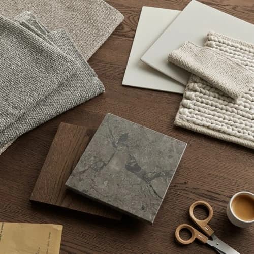
Bringing a personal object into a kitchen design conversation, a favourite ceramic, a length of fabric, a painted wall panel, is one of the most direct ways to communicate a colour intention that no standard palette can quite capture. The process of translating that object into a sprayed, lacquered, or painted cabinet finish is more involved than it might appear, and understanding each step protects you from disappointment when the first door arrives and the light in your kitchen does something unexpected.
Why a Photograph Is Not a Reference
The instinct to send a photograph of a reference colour is understandable, but a photograph is not a usable standard. Camera sensors interpret colour differently depending on white balance, exposure, and the light source present when the image was taken. A warm-toned kitchen photograph of a sage-green cabinet can read as grey-green, olive, or even blue-green depending on the device displaying it. Physical samples, held in the same light as the space they will occupy, are the only reliable starting point for a colour-matching conversation.
Selecting a Non-Destructive Reference Part
If your reference object is something you wish to keep, a tile, a piece of upholstery, a decorative panel, the matching process should be non-destructive. This means the finisher works from a portion of the object that can be returned undamaged, or from a small cutting provided specifically for the purpose. Where the object cannot leave your home, a calibrated physical swatch taken against it in consistent daylight is the next best option. Agree this approach before anything is sent to the workshop, so there is no ambiguity about what will be returned and in what condition.
Two Options for Colour Formulation
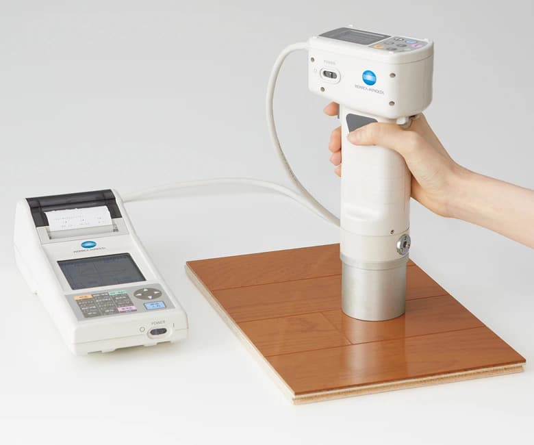
Once a physical reference is in the finisher's hands, there are broadly two routes to formulation. Option A, spectrophotometer reading: a handheld device measures the reflectance values of the reference surface and generates a starting formula. This works well on flat, uniform surfaces such as painted plaster or solid-colour laminates. Option B, visual match by an experienced finisher: for textured, aged, or multi-tonal surfaces, raw linen, patinated metal, hand-thrown ceramics, a skilled eye working iteratively often produces a more sympathetic result than instrument data alone. In practice, the two approaches are frequently combined, with the instrument providing a baseline and the finisher adjusting by eye.
How Substrate and Sheen Affect the Result
A colour that reads correctly on a ceramic tile will not automatically read the same way on a painted MDF door or a lacquered veneer panel. The substrate's texture, porosity, and base tone all influence how a topcoat sits and how light reflects from it. Sheen level compounds this further: the same pigment formula applied at a matt, satin, and gloss finish will appear as three perceptibly different colours in raking light. Nura's owner notes that colour and stain matching is carried out within an agreed scope, confirm at the outset whether your project includes this as standard or whether a specialist matching process applies.
Testing the Sample in Your Own Room
A coated test piece, typically a door-sized panel or a smaller control sample, should always be assessed in the room where the kitchen will live, not in a showroom or workshop. Natural light changes dramatically between morning and evening, and artificial sources vary from warm halogen to cool LED. Hold the sample against your walls, your floor, and any adjacent furniture at different times of day before signing off. What reads as a perfect match at noon under a north-facing rooflight may feel noticeably cooler under the warm downlights you use for evening cooking.
The Approved Control Sample and What It Governs
Once you are satisfied with a test piece, that physical panel becomes the approved control sample, the standard against which every door, drawer front, and panel in your kitchen will be checked before despatch. Keep your own copy. If a replacement door is ever needed, through damage or a future addition, the control sample is what allows the finisher to re-match accurately. Without it, re-matching relies on memory and the original formula, which may drift if materials or suppliers have changed in the intervening period.
Twenty-Four Professional Palette Colours as a Starting Point
For clients who do not have a specific reference object, a curated palette of twenty-four professionally selected colours offers a practical alternative. These are not off-the-shelf RAL or NCS codes applied directly; they are colours that have been assessed against common London interior contexts, period plaster tones, contemporary concrete finishes, warm oak floors, and refined to work well across matt and satin sheens. They serve as a shortlist rather than a limitation: any of the twenty-four can be adjusted in warmth, depth, or saturation once a physical test piece is assessed in your space.
Future Care and Colour Consistency
Approved finishes require specific care to remain consistent over time. Abrasive cleaners, solvent-based products, and prolonged moisture exposure can alter sheen and surface integrity in ways that make future re-matching harder. Your finisher should provide written care guidance as part of the handover. If you are considering a veneer finish rather than a painted one, it is worth noting that veneer is not universally sandable, the thickness of the face veneer and the finish applied to it determine whether light surface marks can be addressed without refinishing the whole panel. The solid wood versus veneer guide explores this distinction in more detail. For a broader view of how finish decisions sit within the full design process, the bespoke kitchens guide is a useful companion read. To discuss a specific reference colour or finish brief, a consultation is the right place to start.
Planning your next step
Use this guide as a starting point for your own brief. Compare the room, materials and practical requirements with the way you want the space to work.
Read the bespoke kitchen planning guide or explore Nura bespoke kitchen services before discussing your project.
Ready to discuss the brief? Contact the Nura studio to share your plans, questions and priorities.