
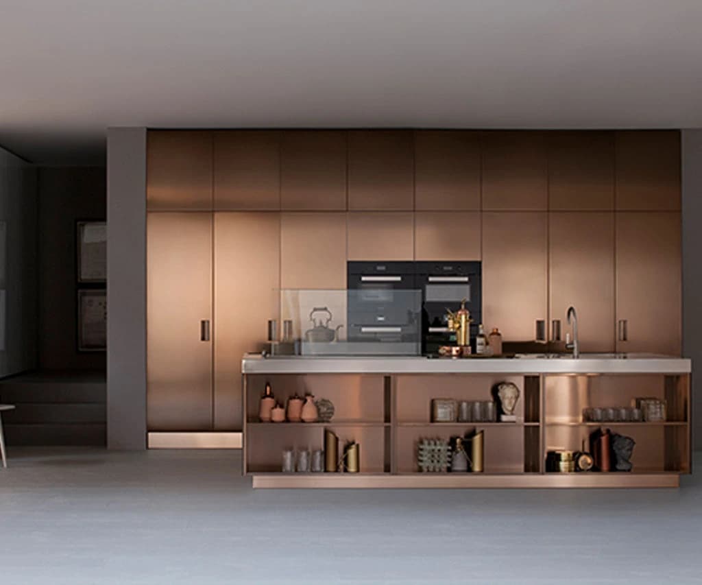

Choosing a kitchen finish beyond white, grey or navy opens a genuinely exciting design conversation, and a more technically demanding one. Metallic and satin surfaces behave differently from matt lacquers: they shift with the angle of light, read differently at cabinet scale than on a small chip, and interact with stone worktops and floor tones in ways that can either unify a room or pull it apart. Understanding the distinction between a metal-effect finish and an actual metal surface is the first step towards a decision you will still feel good about in ten years.
Metal-Effect Laminates and Foils: What They Actually Are
A metal-effect laminate can provide a decorative appearance resembling brushed, aged or polished metal. Its construction needs to be identified from the selected product information: do not assume that every metallic-looking surface has the same facing or coating. A pigmented lacquer, a printed decorative sheet and a material incorporating real metal are different specifications. Ask what is actually supplied and how its edges, cleaning and repair are handled. Judge the sample at the intended cabinet scale, rather than expecting every surface to patinate or be refinished like a solid metal panel.
Real Metal Surfaces: Aluminium, Stainless and Beyond
Actual metal kitchen fronts, most commonly aluminium or stainless steel, are fabricated rather than printed. Aluminium doors can be anodised, powder-coated or left with a brushed mill finish; stainless panels are typically brushed to a specific grit direction. Both materials are heavier than laminate equivalents, which has implications for hinge specification and carcass construction. Real metal surfaces also show fingerprints and water marks more readily than a satin lacquer, so placement matters: an island back panel in brushed aluminium reads beautifully; the same material on every door in a busy family kitchen requires a more considered maintenance conversation.
Satin Lacquers and Their Place in the Palette
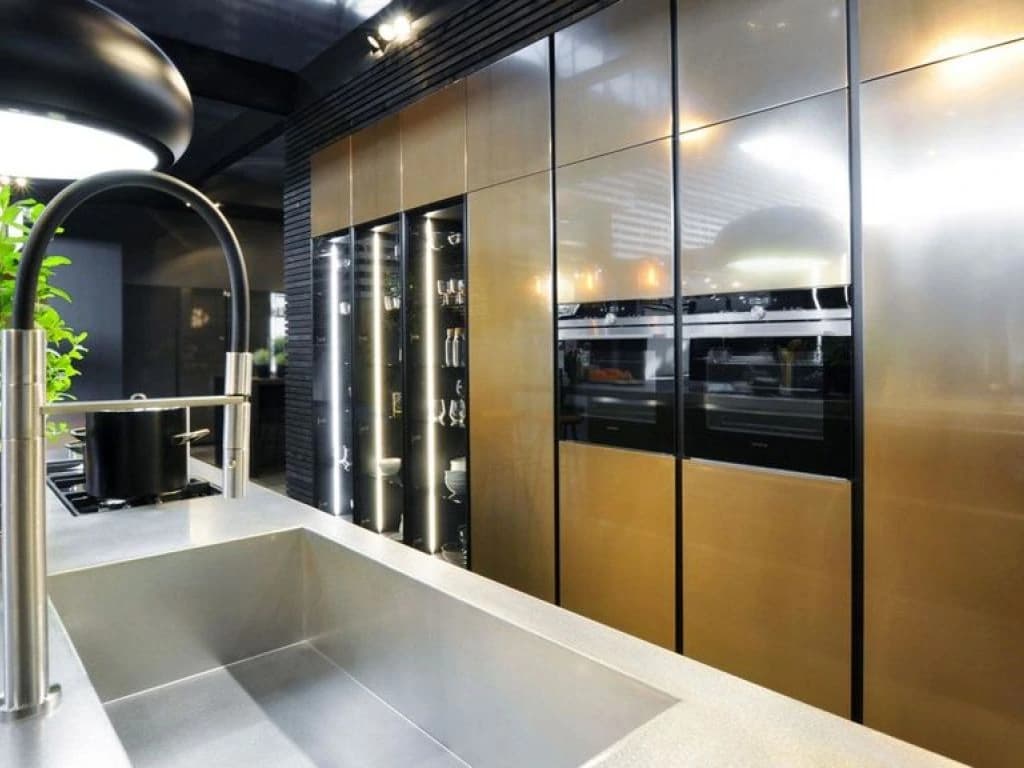
Satin lacquer sits between matt and gloss and is arguably the most versatile finish in a contemporary kitchen. It reflects enough light to feel considered and refined without the mirror-like demands of a high gloss surface. In metallic colour ranges, warm champagne, cool pewter, antique bronze, a satin lacquer can read as genuinely metallic from across the room while remaining far more forgiving of daily contact than a foil or real metal panel. The key variable is the pigment: a well-mixed satin in a warm gold tone will shift perceptibly between morning and evening light, which is either a feature or a problem depending on your room orientation.
Reading Samples Vertically and at Scale
Every experienced designer will tell you to hold a sample vertically rather than flat on a table, because cabinet doors are vertical surfaces and light falls across them accordingly. A brushed bronze laminate that looks rich and warm lying flat on a worktop sample can appear flat and slightly greenish when stood upright under a north-facing window. Equally, a small chip gives no reliable sense of how a finish reads at door scale. Wherever possible, request a full door sample or at minimum a 300 mm square before committing. This is particularly important with directional finishes, those with a visible grain or brush direction, because the orientation of that direction across a run of tall cabinets is a design decision in itself.
Coherence with Stone Worktops
Metallic finishes and stone worktops have a complex relationship. A warm brushed brass lacquer paired with a cool Calacatta marble can feel intentionally contrasted or simply discordant, depending on the undertones in both materials. The safest approach is to bring physical samples of your shortlisted door finish and your stone slab into the same space at the same time, under the actual lighting conditions of the room. Veining in natural stone often carries warm gold, grey or rust tones that can either echo or clash with a metallic door finish. Engineered stones tend to have more predictable undertones, which can make the pairing exercise slightly more straightforward.
Floor Tone and the Risk of Overload
A common mistake with metallic finishes is treating the kitchen in isolation from the floor. Warm oak flooring paired with a brushed bronze door finish and a gold-veined stone worktop can tip from cohesive into overwhelming. One of the three elements usually needs to recede, either a cooler, more neutral stone, a floor with less warm pigment, or a door finish that reads as metallic in character but is anchored by a cooler base tone such as pewter or graphite. The floor is often the hardest element to change retrospectively, so it should anchor the palette conversation rather than be considered last.
Custom Colour Matching: Scope and Expectations
For clients who want a specific metallic tone that does not exist in a standard range, custom colour matching is possible within certain parameters. At Nura Interiors, colour and stain matching is included within an agreed project scope, meaning the target colour is established at the outset and the finish is produced to that reference. This is distinct from an open-ended matching surcharge applied mid-project. It is worth understanding that custom metallic lacquers, in particular, can vary slightly between production batches, so ordering replacement doors later may require a new colour reference to be agreed. Discuss batch consistency with your designer before finalising a bespoke metallic specification.
A Practical Shortlist Framework
When narrowing a metallic or satin finish shortlist, consider these four axes: light direction in the room (review how the actual daylight changes the sample rather than applying a fixed rule to the room’s orientation); household use intensity (handle the exact samples to see how fingerprints and marks appear); stone and floor undertone compatibility (test physically, not digitally); and the finish's behaviour at door scale versus chip scale. A shortlist of two or three finishes tested simultaneously in the actual room, on vertical samples, will resolve most decisions more reliably than any amount of digital rendering. For a broader view of how finish choices interact with material selection, the Nura guide to solid wood versus veneer offers a useful parallel framework. If you are at the early stage of defining your kitchen's overall direction, the Nura bespoke kitchens guide sets out how finish, material and construction decisions connect across a full project. To discuss your specific palette with a designer, book a consultation.
Planning your next step
Use this guide as a starting point for your own brief. Compare the room, materials and practical requirements with the way you want the space to work.
Read the bespoke kitchen planning guide or explore Nura bespoke kitchen services before discussing your project.
Ready to discuss the brief? Contact the Nura studio to share your plans, questions and priorities.