
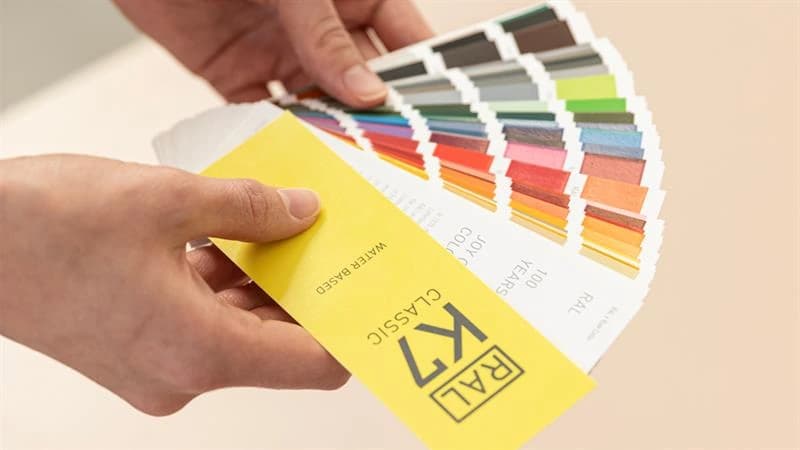

The right kitchen colour often comes from somewhere beyond a showroom display: a favourite paint shade, a fabric, a ceramic tile or the warm grey running through a piece of stone. Custom colour matching can bring those references into the cabinetry, allowing the kitchen to belong to the wider interior.
The important step is translating the reference into an approved physical finish. A colour name or a digital image alone cannot describe how a cabinet door will look in your room.
Begin with a reference everyone can identify
Bring the actual sample where possible. If your starting point is a branded paint, record the manufacturer, colour name and code. If it is a tile or fabric, agree which part of the surface is the reference. A patterned object may contain several colours that look quite different when isolated.
Photographs are useful for explaining an atmosphere. They are less reliable as colour standards because the camera, lighting and screen all affect what you see. A reference photograph should start a discussion rather than become the sole basis for ordering a kitchen finish.
Understand what scanning contributes
Colour measurement can help a finishing team develop a formulation. It does not remove the need to review the finished result. The coating, preparation, substrate and sheen all contribute to appearance, and a sample needs to reflect the proposed cabinet finish.
A colour match to a familiar paint shade also does not necessarily mean that the original paint product is being applied. Ask which coating system is specified. A factory-applied lacquer matched to a reference colour is a different description from cabinetry painted in that brand's own product.
This distinction helps with care instructions and future repairs as well as with expectations about the initial appearance.
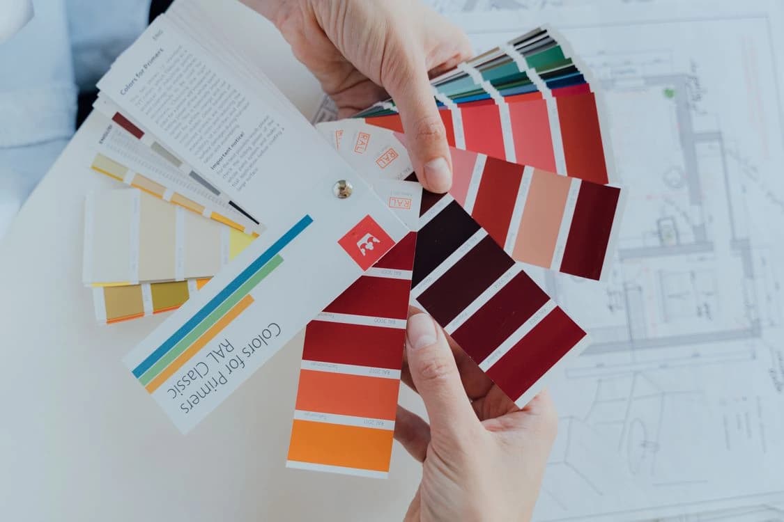
Look at the sample in more than one light
Two materials can appear to match in one light and separate in another, an effect explained by colour specialists X-Rite. That is a good reason to review cabinet samples alongside the finishes they need to complement, using relevant daylight and the planned interior lighting.
You do not need to turn the house into a laboratory. Put the sample where the cabinetry will sit, view it vertically, and return to it at different times. A green-grey beside a warm stone can feel different from the same finish beside a cool white wall. Make the decision in the relationship that matters.
Choose colour and sheen together
Matt, satin and gloss versions of a colour will not read identically. Reflections can make a door look lighter from one position and darker from another. Metallic and other effect finishes introduce further variation with viewing direction.
Agree the appearance on a representative panel rather than a small printed chip. Review an edge or profile where it matters to the design. On a framed door, the recesses and raised sections can make light and shade part of the colour experience.
Our guide to white tones and textures is useful if your palette depends on close relationships between pale surfaces.
Ask what the matching price includes
A clear quotation should separate the selected finish from any optional sampling, specialist effects or later changes. Ask how many sample stages are included, what happens if you change the colour after approval, and whether the same finish applies to visible end panels, fillers and internal surfaces.
Nura's approach is to explore colour as part of the design brief. Bring the shade you want rather than assuming that an initial selection defines the whole available palette. The quotation should confirm the matching scope and any costs for your particular finish, so the decision is clear before manufacture.
Approve a finish, not a promise on a screen
For example, imagine a kitchen intended to continue the soft clay tone of an adjoining living room. A sample that looks convincing against the wall may feel too reflective beside the chosen worktop. Changing the sheen could resolve the relationship more effectively than changing the colour itself. This is a hypothetical design decision, but it shows why sampling is useful.
Record the approved panel, coating description, sheen and reference code in the finish schedule. Keep a physical control sample where possible. Confirm how the maker will address normal production variation rather than expecting a photograph of the approval to capture every subtlety.
Plan for the years after installation
Ask for cleaning guidance and the information needed if a door is damaged later. A colour code is helpful, but it does not capture the entire coating system or how a finish may change with age. Repair and replacement should be discussed for the actual product supplied.
If your palette is already taking shape, bring your references to a Nura consultation. We can consider the cabinet colour with the stone, flooring and light, then define the sample that needs your approval.
Planning your next step
Use this guide as a starting point for your own brief. Compare the room, materials and practical requirements with the way you want the space to work.
Read the bespoke kitchen planning guide or explore Nura bespoke kitchen services before discussing your project.
Ready to discuss the brief? Contact the Nura studio to share your plans, questions and priorities.