
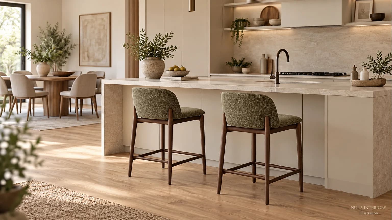

Choose kitchen bar stool colours by deciding what should attract attention: the island, the seats or the room beyond. A similar tone can make the seating quieter; a contrasting seat can become an accent. You do not need an identical match to the cabinets or dining chairs. Compare the seat and frame separately, then look at them together in your kitchen.
Decide what you want to notice
Stand at the doorway and then beside the dining table. Which part of the room would you like to notice first? Keep that answer in mind while comparing two stool options against a photograph of the same island. Use the same view for both, with the floor and any retained dining chairs visible. A moodboard is a starting impression, not a reliable colour match or proof of scale.
Write one sentence beside each option: “The seats should be the accent” or “The island should remain the focus.” This gives you a reason for the choice beyond liking a stool in an isolated product photograph.
Separate the seat from the frame
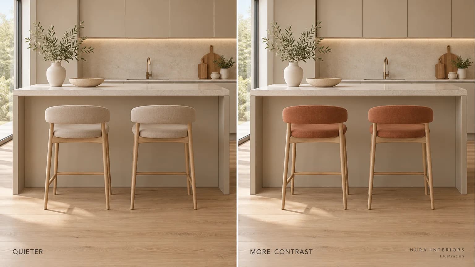
Look first at the upholstery or seat finish against the island front. Then compare the legs against the floor. A quiet seat with a dark frame gives a different outline from the same seat on pale timber legs. Change one element at a time in your shortlist so you can tell which difference you prefer.
| Aim | Compare | Record |
|---|---|---|
| Quieter seating | Seat tones close to the island | Which option lets the island lead? |
| A colour accent | A restrained and a stronger seat colour | Which one would you want repeated across the row? |
| A connected room | Stool and dining-chair finishes in one view | Which shared detail do you want to keep? |
Include the dining chairs in the same view
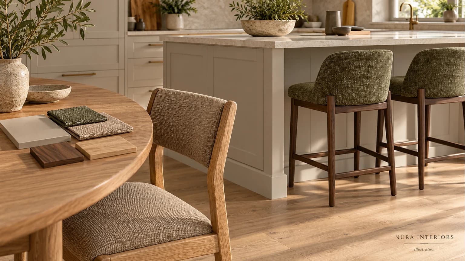
Imagine a greige island, oak flooring and taupe dining chairs that are staying. Taupe stool seats could repeat the dining upholstery; muted olive could introduce another colour while leaving the dining chairs unchanged. A walnut frame would add a darker outline than pale oak. These are alternatives to compare, not a rule that either combination is right for every home.
An identical furniture set is an option, but it is not compulsory. Decide whether you want a shared colour, a related timber or deliberately different seating. If several woods are involved, our guide to mixing wood tones considers that separate decision.
Compare the finish you would actually order
Where available, request the supplier’s actual upholstery or finish sample and look at it beside your retained materials in daylight and under your room lighting. Use our kitchen colour-sample guide to prepare that comparison. Confirm the exact product’s dimensions, care instructions and suitability for your household separately; colour alone cannot establish fit or comfort. The illustrations here are palette ideas, not installation drawings or product tests.
Bring the seating into your kitchen brief
For a Nura kitchen design conversation, bring room photographs, references for the chairs and floor you are keeping, and your two stool options. Add your sentence about what should stand out. That brief helps connect seating with cabinetry and the wider room. Before arranging a Fulham showroom visit, ask the studio which relevant material comparisons are available. Discuss your kitchen palette with Nura.