
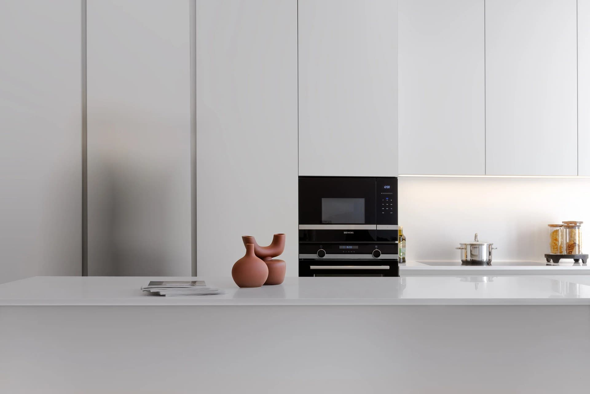

Before you settle on a kitchen colour, give a physical sample a place in the room itself. View it beside the floor and worktop, in daylight and under the lights you use after dark. The aim is a small, repeatable check of how the finishes work together in your home.
Start with the finish you will actually specify
Ask for a movable sample of the proposed door finish, rather than choosing from a photograph alone. A painted board can help you explore a colour, but it does not necessarily represent a lacquered door, stained veneer or textured surface. Confirm what the sample represents and what still needs approval.
Choose a sample large enough to see its texture and, for timber, the grain. If you are comparing several colours, label the backs so you can return to the same options without relying on memory. Keep the selection manageable: two or three considered choices are easier to assess than a crowded table of swatches.
Make a small palette in the actual room
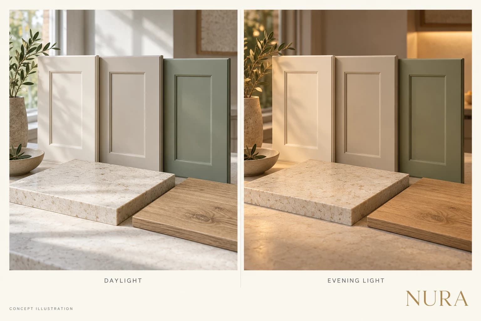
Bring the cabinet sample together with the proposed worktop, flooring and wall colour. Place them beside one another, then step back. Look for the relationship you want: a quiet tonal arrangement, a warmer contrast or a distinct change between the cabinetry and surrounding surfaces.
Hold the door sample upright where the cabinetry will sit. Keep the worktop sample horizontal. Moving everything onto a table is convenient, but it can hide how the materials will meet when installed. Try more than one position, especially if the room has a bright window at one end and a darker corner at the other.
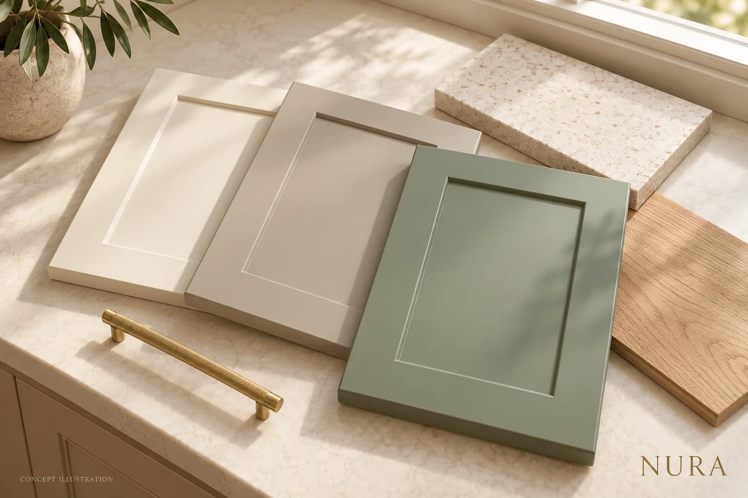
Return in daylight and after dark
Look at the same combination in the morning, later in the day and in the evening. Use the room normally rather than searching for one perfect moment. Note whether a colour feels too cool, too warm or simply different from what you expected. There is no need to decide immediately.
After dark, switch on the lighting you expect to use together. If the final fittings are not installed, record that limitation and revisit the samples when you can assess a representative light. A photograph can help you remember the arrangement, but use the physical samples for the final comparison.
Record the choice before approving it
Once a combination feels right, record the product, colour reference, finish and sample identifier with your designer or supplier. For timber, ask how natural variation and grain direction will be represented. Keep the agreed sample available as the design develops.
Use a simple colour observation sheet
Copy this table into your notes or print it before you compare two or three samples. Add the date, room position and lights used. In each box, describe what you see beside the same flooring and worktop: for example, too cool, warmer than expected or a contrast you like. These are personal observations, not scores or an automatic way to select a winner.
| Observe | Sample A | Sample B | Sample C |
|---|---|---|---|
| Morning daylight | Notes: ___ | Notes: ___ | Notes: ___ |
| Later daylight | Notes: ___ | Notes: ___ | Notes: ___ |
| Evening lights | Notes: ___ | Notes: ___ | Notes: ___ |
| Next step | Notes: ___ | Notes: ___ | Notes: ___ |
If one combination only feels right at a particular time, revisit it before approval. Mark any missing materials or temporary lighting as unresolved. Keep the physical samples with the notes so another person can repeat the comparison.
A documented palette: Ancona
The published Ancona project pairs matt black lacquered cabinetry with Palladio Moro terrazzo, ribbed glass and brass handles. The photograph shows why a cabinet colour should be considered with the surfaces and details around it: the cabinetry forms one part of a larger palette.
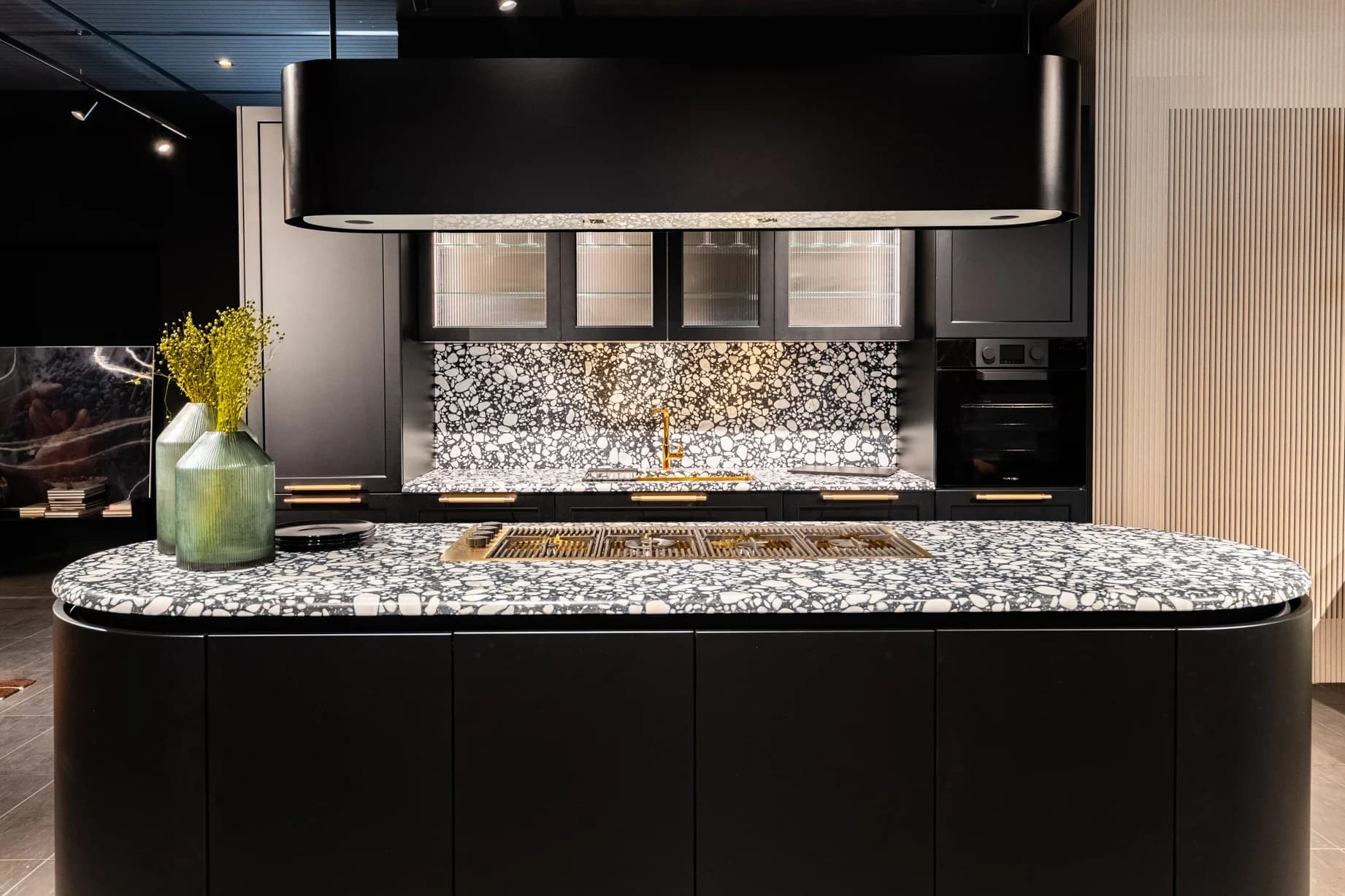
Use the Ancona project photographs and specification to study the finished combination. The published record does not establish how its samples were tested or why the client approved them, so those steps are not presented here as a Nura case history. For your own brief, bring the actual proposed finishes together and use the observation sheet above.
For the wider decisions around layout, materials and specification, read the Nura bespoke kitchen planning guide.
For more on cabinet materials, read Solid Wood or Veneer. To discuss your own palette and kitchen brief, arrange a Nura consultation.