
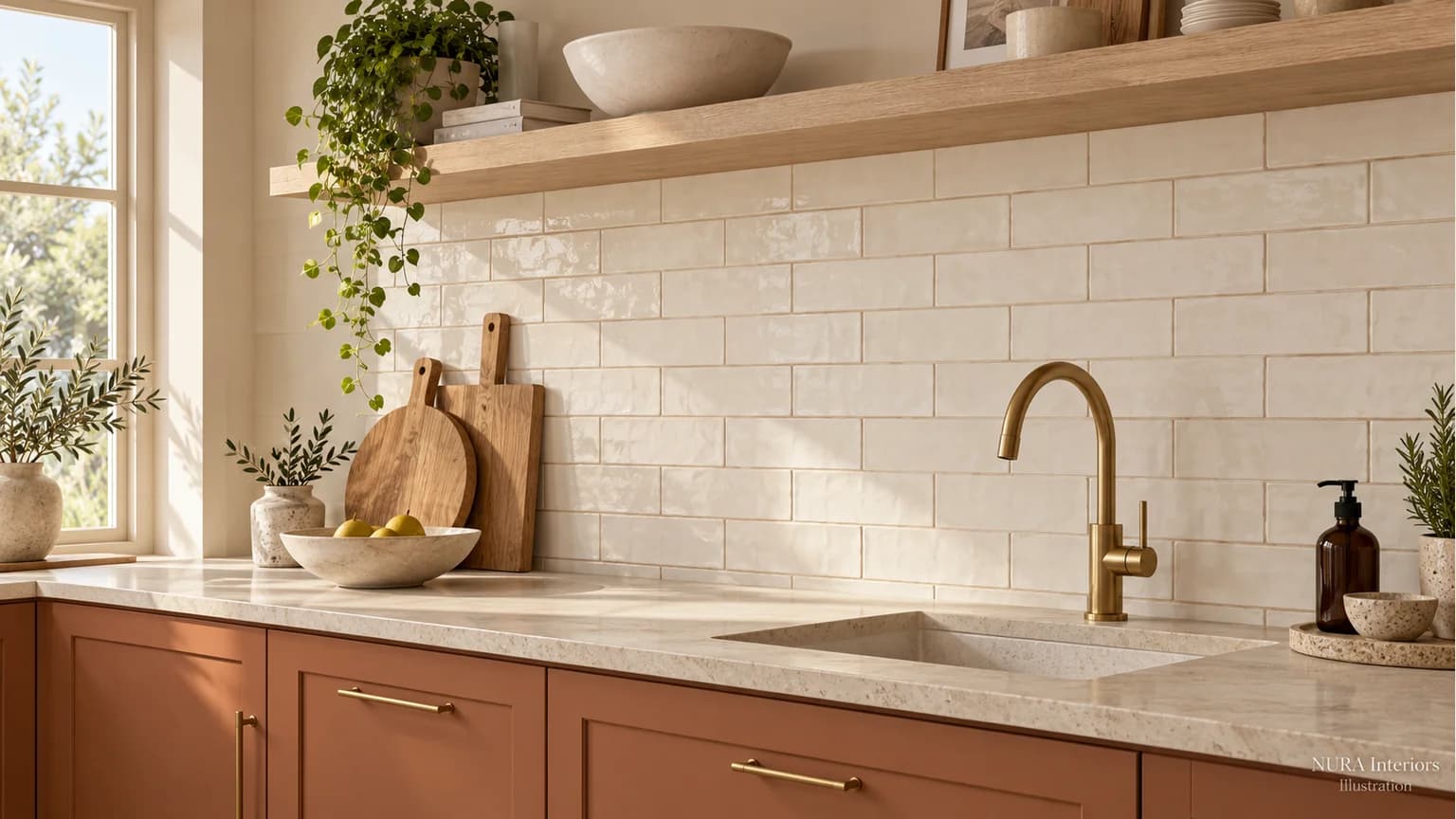

Choose kitchen splashback grout colour with the whole wall in view: tile, cabinet front and worktop together. A close match lets the tile surface read more quietly; a contrasting joint makes the layout more noticeable. Neither is automatically better. Start by deciding whether you want to notice the tiled pattern or the surface beside it.
Give the wall a role
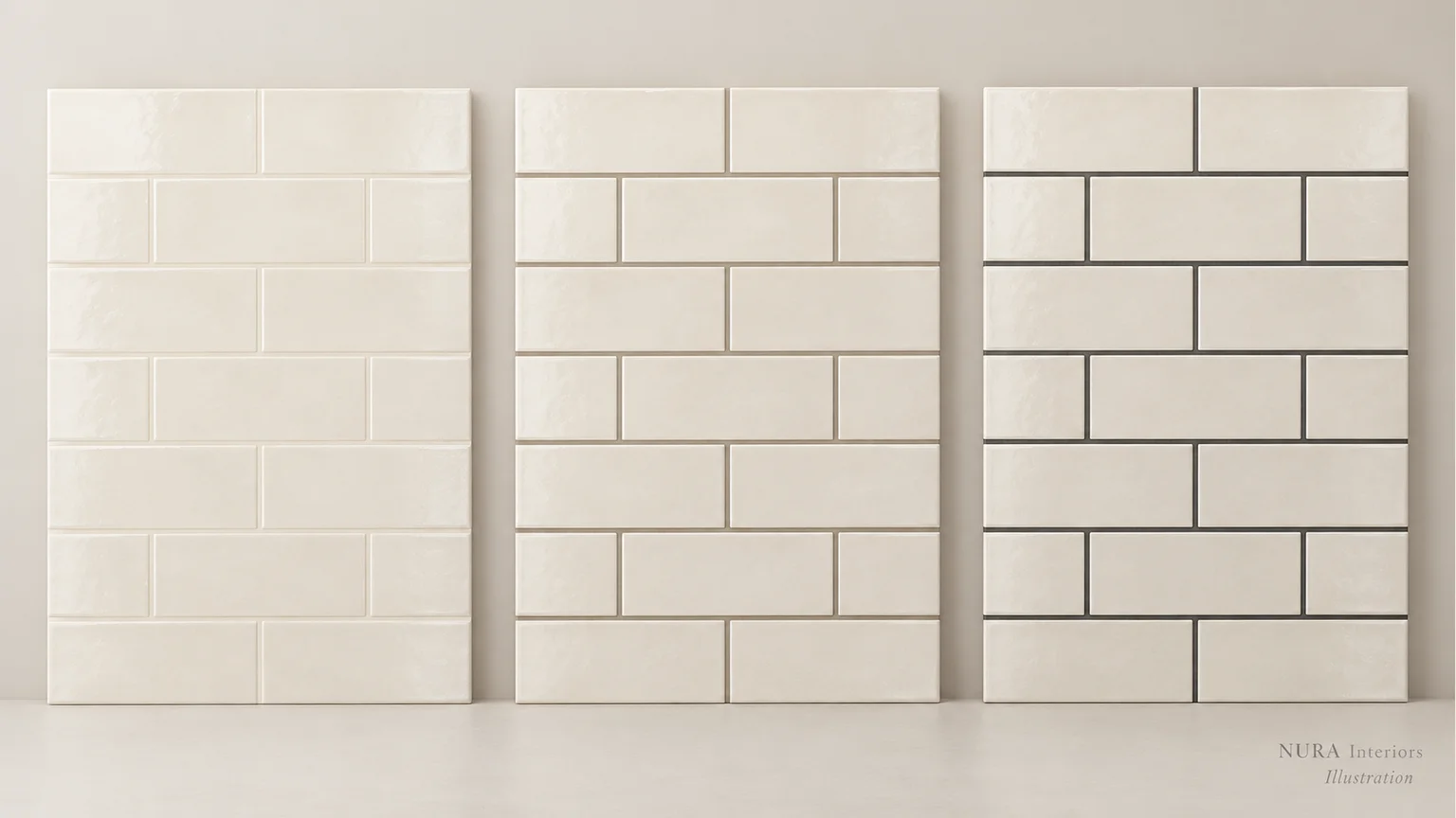
Imagine ivory rectangular tiles above warm cabinetry and a strongly veined worktop. If you want the worktop to lead, compare a close ivory grout with a gentle warm grey. If the tile arrangement is the feature, include a darker outline. This is a hypothetical palette, not a specification or a photographed Nura project.
Should grout be lighter or darker than the tile? Compare the relationship, rather than choosing a rule. A light joint can contrast strongly with a dark tile; a dark joint can nearly disappear beside a similarly dark tile. Look at the tiled area from across the room as well as close up.
Compare one decision at a time
Ask your supplier or tiler how to obtain suitable cured samples using your chosen tile and grout. Keep the tile layout and agreed joint width consistent when comparing colours. Otherwise you may be responding to a different pattern as well as a different shade.
| Your aim | Compare | Record |
|---|---|---|
| A quiet wall | A close tile match | Does the worktop still lead? |
| A gentle outline | A modest tonal contrast | Does it sit with the cabinet finish? |
| An obvious pattern | A stronger light-dark contrast | Do you still like the whole wall? |
Stand the sample upright
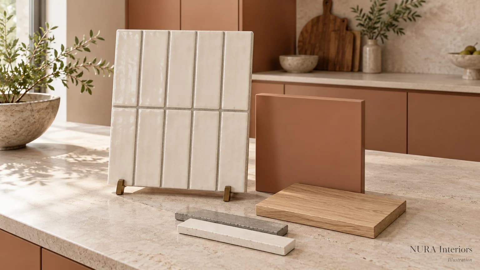
Place the sample securely upright beside the cabinet and worktop references. View it in daylight and with the kitchen lights on, then from the usual entrance or dining seat. Write down which combination you prefer and why. Our kitchen colour sample guide helps with the wider palette; keep the worktop decision in the same conversation.
Mapei’s official colour palette cautions that printed or screen colours may differ from installed grout because of factors including preparation, installation and lighting. A website image is a starting point, not confirmation of your finished colour.
Keep colour and performance separate
Record the exact product and colour reference. Ask the supplier and tiler to confirm suitability for the tile, location and joint width, plus installation and care instructions. Colour alone does not establish stain resistance, waterproofing or whether sealing is required. The illustrations here cannot approve those details.
Bring the relationship to the design conversation
For a Nura kitchen design conversation, bring a tile sample, cabinet and worktop references, room photographs and your preferred balance between a quiet wall and a visible pattern. Ask what relevant examples are available before a Fulham showroom visit. These inputs connect a small joint-colour decision with the whole kitchen. Discuss your kitchen palette with Nura.