
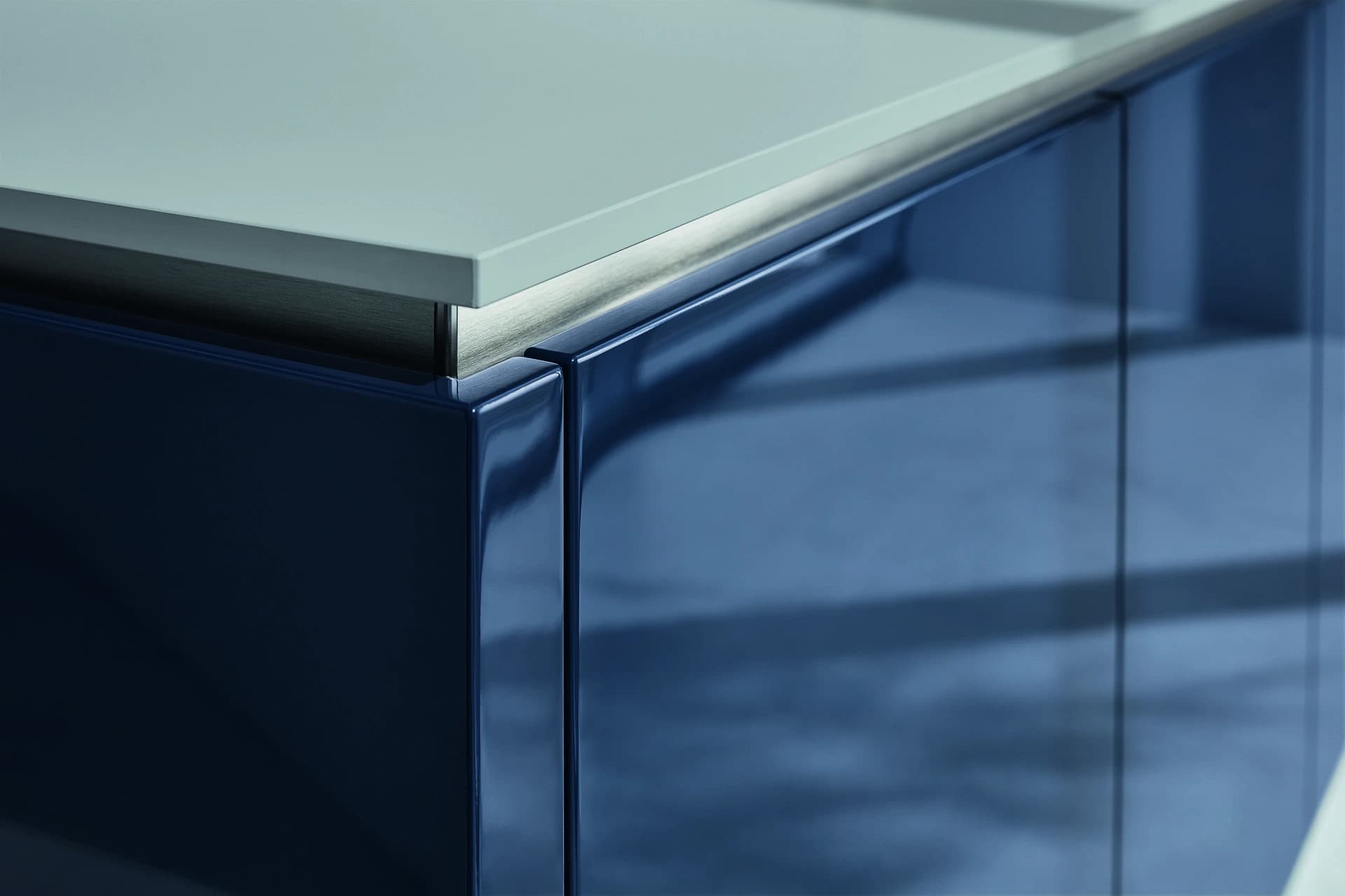

The same cabinet colour can feel quite different in matt, satin or gloss. Light moves across the surface differently, reflections become more or less prominent, and a long elevation can change character as you move through the room. A metallic effect adds another visual decision alongside the sheen.
The useful comparison starts with representative samples of the actual finishes being offered. Broad labels help organise the discussion, but they do not establish cleaning performance, durability or repair options on their own.
Describe the coating as well as the appearance
Ask which coating system is proposed for the door and what substrate it will be applied to. Lacquer is a coating description, while matt, satin and gloss describe aspects of appearance. Metallic refers to an effect that needs its own sample and product explanation. These terms should not be treated as a complete material specification.
Record the selected finish on the quotation and sample schedule. If two suppliers use the same sheen label, their samples may still differ. Compare what they are actually offering rather than assuming that a shared description produces an identical surface.
Matt: consider the quietness and the detail
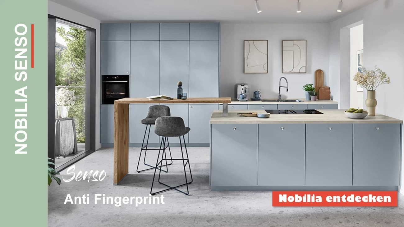
A lower-sheen finish can help cabinetry read as a restrained background. It may suit a room where texture, stone or timber should receive more attention than reflections on the doors. Review it across a broad panel and around any profiles, where shadows contribute to the appearance.
Handle the sample and examine the contact marks in relevant light. Some finishes have specific fingerprint-resistance claims; others do not. Ask whether such a claim applies to the selected product, and request its care guidance. Do not assume that every matt finish behaves in the same way.
Satin: assess the sample between the extremes
Satin is often used to describe an appearance between a very low sheen and a highly reflective finish. That still leaves considerable room for variation. Ask to see the intended coating beside other relevant options rather than selecting it because the name sounds like a universal compromise.
Check the way the colour sits beside the flooring, worktop and handles. Look at a sample from the dining side as well as from directly in front. A surface that appears quiet close up may reflect a window or pendant differently across a long run of cabinetry.
Gloss: design with the reflections
A reflective door can become an active part of the room's composition. Think about what it will reflect: windows, the floor, adjacent furniture and lighting. Those relationships can be more important than a general claim that gloss makes every kitchen look larger.
Review door edges and profiles on a representative sample, and ask how the finished elevation will be aligned. Then test ordinary handling. Whether marks are noticeable depends on the colour, coating, lighting and use. Choose the surface with a realistic understanding of its care requirements rather than treating maintenance as an afterthought.
Metallic: agree the effect at cabinet scale
A metallic-looking finish might be a coating effect or another specified surface construction. Ask the supplier to identify it accurately. A door with a metallic appearance should not be assumed to patinate, polish or repair like a solid metal component.
View the sample vertically and from several positions. If the appearance depends on direction, establish how adjoining panels will be oriented and approved. A small chip can introduce the effect, but a larger sample is more useful for judging the amount of variation you want across an island or storage wall.
Compare the same colour under useful conditions
Where possible, compare alternatives side by side against the same physical reference. Use the relevant daylight and planned interior lighting, and place the samples beside the materials they need to complement. This gives a clearer basis for discussion than photographs taken in different showrooms.
For a hypothetical kitchen, a client might find that the lower-sheen option sits quietly beside patterned stone while a glossier sample introduces distracting reflections. Another room might benefit from those reflections. The exercise helps you decide what works in that interior without presenting the result as a universal ranking.
Ask how care and repair will work
Request cleaning instructions for the actual coating, including which products and cloths are suitable. Discuss what the supplier would recommend if a door were scratched or chipped. Some damage may need specialist treatment or component replacement; an invisible local repair cannot be assumed from a colour code.
Keep the approved sample and coating description with the project information. If a replacement is required later, that record is useful, although age and production differences may still affect the appearance. The wood and veneer guide covers related construction and repair considerations.
Make the finish part of the whole brief
Nura can explore colour and finish choices as part of the bespoke kitchen design. Confirm the matching, sampling and specialist-effect scope for your project before approval, rather than assuming that every finish is included on identical terms.
Bring your worktop, floor and colour references to a consultation. Comparing the materials together is the most useful way to choose a sheen that belongs in your home.
Planning your next step
Use this guide as a starting point for your own brief. Compare the room, materials and practical requirements with the way you want the space to work.
Read the bespoke kitchen planning guide or explore Nura bespoke kitchen services before discussing your project.
Ready to discuss the brief? Contact the Nura studio to share your plans, questions and priorities.