

A Christmas colour scheme should flatter the room you already have, rather than require a new room around it. The most useful question is not simply which colour is fashionable. It is whether your chosen ribbon, glass, foliage and lighting can sit comfortably beside the permanent finishes in your home.
Quick answer: Begin with one existing material, such as oak, walnut, painted cabinetry or upholstery. Choose two principal seasonal colours, use one accent sparingly, and test them in both daylight and evening light. The five palettes below are practical NURA interpretations of broader seasonal design directions, not verified best-selling UK colour trends.
For a room-by-room introduction, see our 35 Christmas decoration ideas for 2027. If you are choosing permanent finishes as well as festive accessories, our kitchen colour-matching guide explores the underlying decision in more depth.
What the 2027 forecast can and cannot tell us
Christmasworld Trends 27+ describes broad seasonal design directions, including soft crafted looks, stronger structural contrasts and decorative heritage references. Those directions are useful inspiration. They do not establish that one colour will dominate British Christmas shopping in December 2027.
Our editorial approach is to translate broad themes into combinations that can be tested with physical samples. A beautiful photograph might show a room at dusk; your decorations must also work on a grey Tuesday morning, when the oven is on and the family is moving between rooms.
Palette 1: soft white, caramel and glossy red
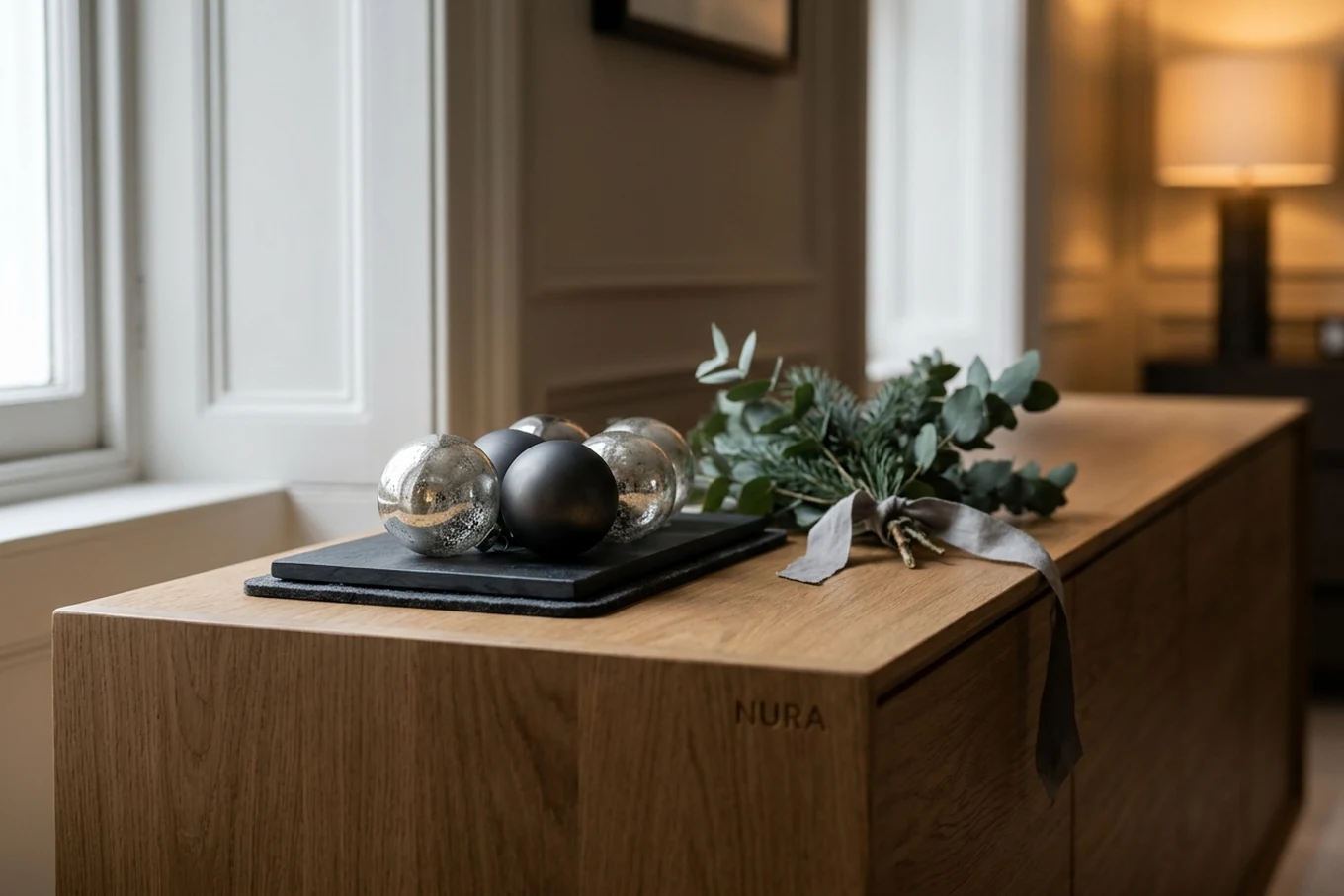
Use soft white paper as the calm background, warm caramel ribbon as the bridge to timber, and a small amount of lacquered red for energy. A large red object can overwhelm a pale room; instead try three or four red baubles separated by neutral ornaments. On a pale oak sideboard, a folded linen runner and one paper star may be enough before you add anything more.
Best with: natural oak, creamy walls, linen and uncomplicated contemporary furniture. Try first: hold a white paper star against the wall in daylight. If it looks too blue, switch to a warmer white instead of replacing every other piece.
Palette 2: silver, graphite and warm wood
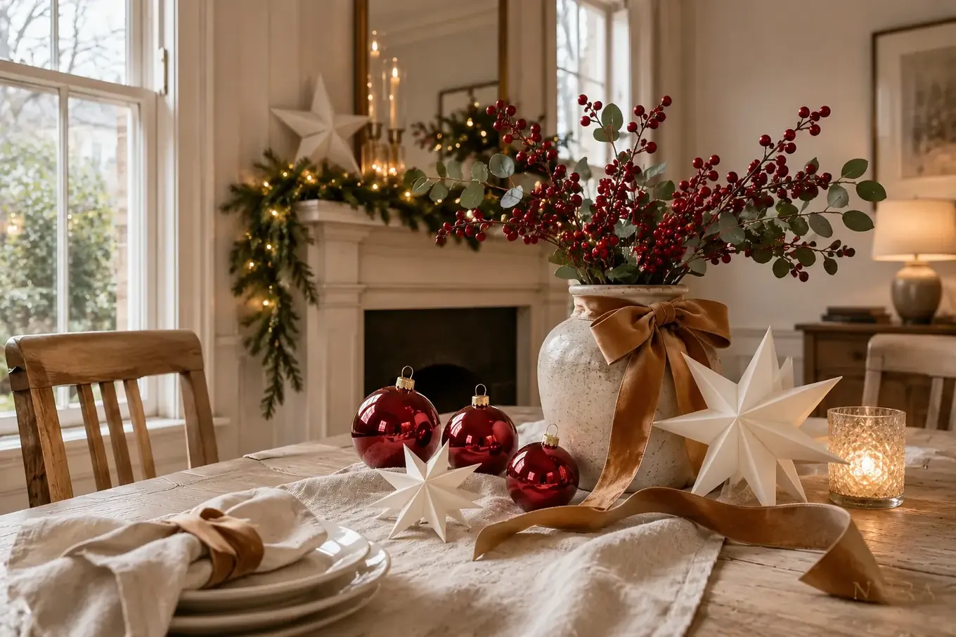
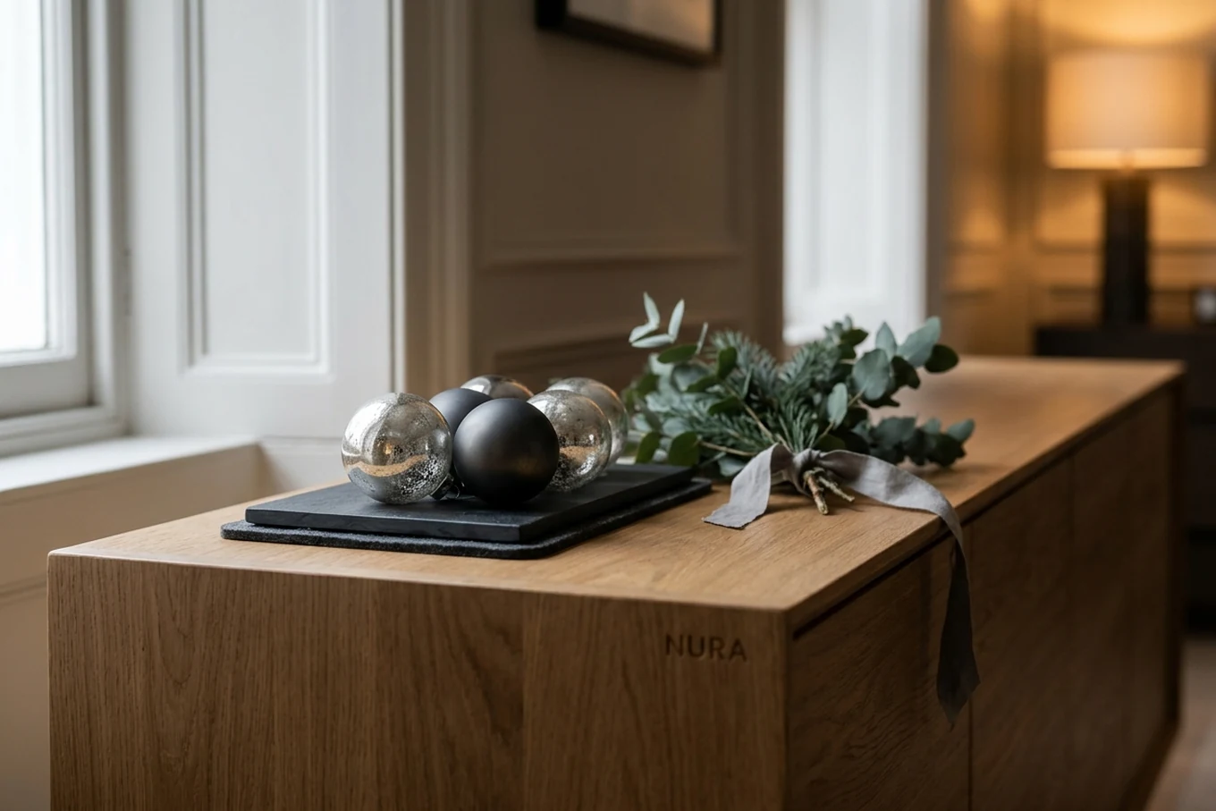
Silver makes a clean highlight; graphite gives it structure; visible timber stops the room feeling cold. Put silver and charcoal objects on one warm wooden surface rather than spreading metallic pieces across every shelf. Satin and highly reflective finishes can coexist, but a mixture of too many glittered textures soon becomes noisy.
Best with: oak consoles, stone worktops and simple shelving. Try first: a small silver ornament beside the timber you want to feature. Use a protective felt base beneath anything metallic; do not drag a decorative bowl across veneer or lacquer.
Palette 3: oxblood, moss green and walnut
This is a tonal, layered scheme for deeper rooms. Use oxblood fabric or ribbon, muted green glass or felt, and allow the walnut furniture to remain the most substantial brown element. Include pale linen or clear glass so the composition can breathe. Green in this palette describes the colour, not an instruction to place damp moss against wooden cabinetry.
Best with: walnut joinery, deep paint colours, period sitting rooms and heavier textiles. Try first: position one dark red ribbon beside a green object on the same shelf and assess whether both are still visible after sunset.
Oxblood vs. Burgundy distinction: While Oxblood carries a deep, brown-black undertone that anchors dark walnut joinery and mossy greens without reading festive-commercial, Burgundy leans toward rich wine and berry undertones that require aged antique brass or gold to lift its reflective surface.
Palette 4: burgundy and antique gold
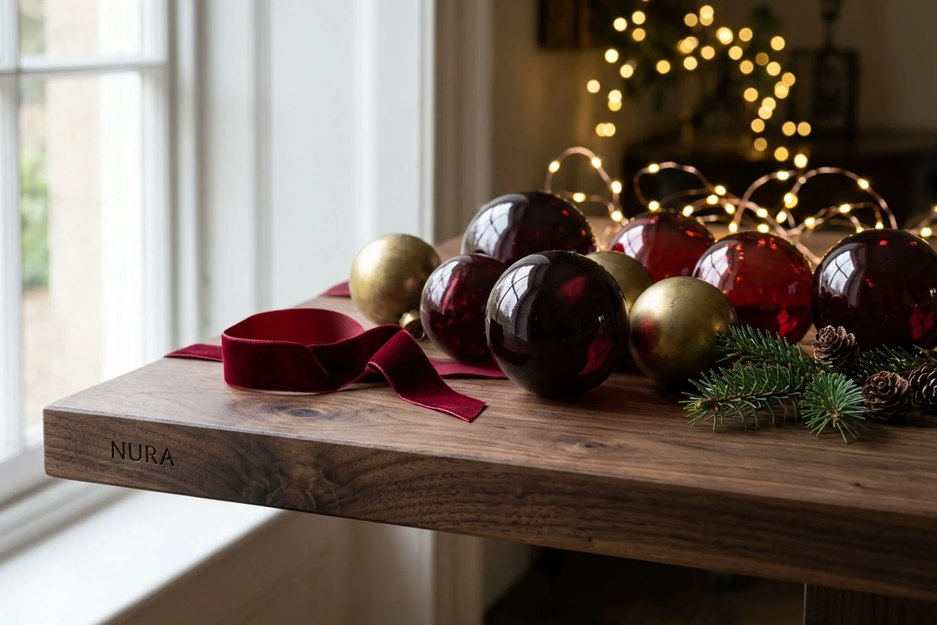
For a familiar festive look, introduce burgundy velvet alongside aged-gold ornaments. Keep gold as an accent, not a coating for every surface. One large velvet bow on a tree and two small touches repeated on the table feel related without having to match every decoration. Existing family pieces often add more character than a newly purchased matching set.
Best with: traditional rooms, inherited glass ornaments, framed artwork and warm metal details. Try first: a burgundy ribbon on an otherwise undecorated branch. Stand back before you add the next one.
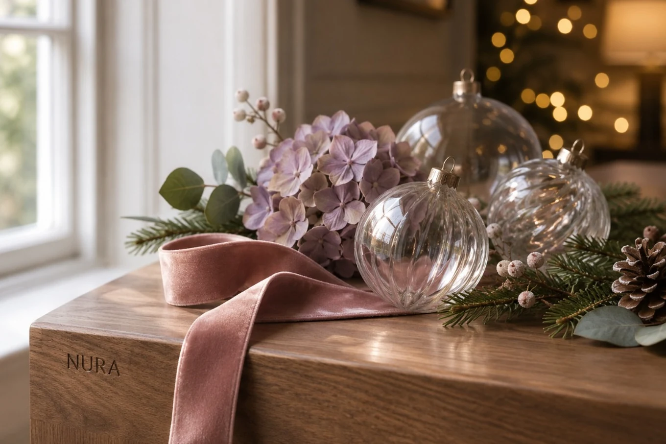
Palette 5: dusty rose, faded lilac and clear glass
Low-saturation pink and lilac can produce a light, translucent seasonal scheme. Compare them side by side before purchasing: a peach-leaning pink and a cold lilac may clash. Off-white paper and clear glass help connect the two. In homes with young children or energetic pets, move fragile glass up high or choose an alternative material with a similar finish.
Best with: softly painted interiors, pale stone, gentle upholstery and minimal shelving. Try first: two ribbon samples seen both by the window and under the lamps you use at night.
A five-step colour test before you buy
- Photograph the space in daylight, with its principal furniture and joinery visible.
- Pick one permanent material to respect: perhaps an oak floor, green kitchen cupboards or a limestone worktop.
- Lay out six to ten decorations you already own and identify a repeated colour.
- Bring in no more than two new samples. Test matt versus glossy at the same time.
- Check your choice from the entrance, from a seated position and after dark. Remove pieces until there is a clear focal point.
If you are styling a kitchen, protect worktops and keep the cooking zone open. The island is often a working surface, not just a festive plinth. In a narrow room, an attractive display becomes a poor choice if people have to turn sideways to pass it.
How to make the palette last beyond one December
Choose reusable fabric ribbon, repairable ornaments and pieces that can work in more than one room. Keep a photograph of your final arrangement and label boxes by colour or room. You can refresh the overall look next year by changing only a minor accent; buying a completely new scheme is rarely necessary.
For practical placement ideas, explore Christmas tree decorating ideas 2027, and if warm and cool bulbs are changing your colour choices, read our Christmas lights guide.
Frequently asked questions
Is burgundy definitely the most popular Christmas colour in 2027?
No reliable UK sales evidence establishes that. Burgundy is one workable heritage palette, not a proven market winner. Forecast directions and real purchases are different things.
Should I coordinate every decoration?
Not necessarily. Repeating a ribbon colour or material across several areas can make older, unmatched decorations feel intentional without removing the personal pieces you love.
What is the best Christmas colour for a wooden kitchen?
There is no universal choice. Compare your wood's undertone against a small group of decorations in the kitchen's actual light, and check whether the arrangement leaves enough usable worktop.
NURA design note: Collect one photo of the room, two ribbon or material samples, and a list of decorations you would like to keep. That is a more useful starting point than a shopping basket full of coordinated ornaments. For decisions about permanent finishes or joinery, speak with the NURA studio.