
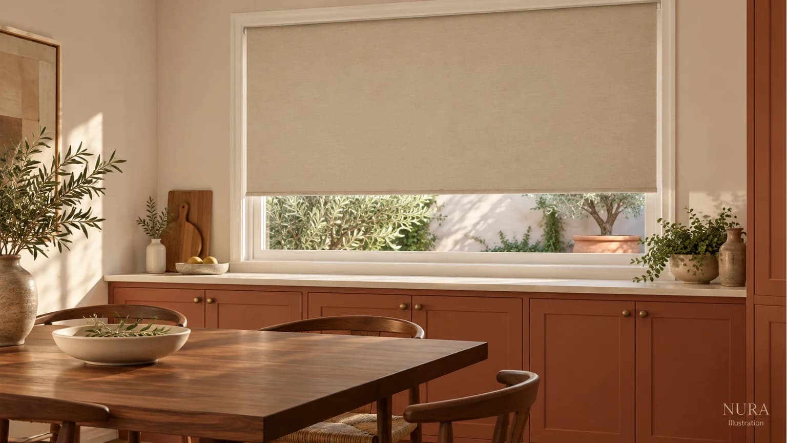

Choose kitchen blind colour for the window you will see when the blind is lowered, as well as the smaller amount of fabric visible when it is raised. A colour you enjoy as a narrow band may be more prominent across the full opening. Decide whether you want that panel to join the background or become a separate feature in your kitchen palette.
Bring the fabric into the room
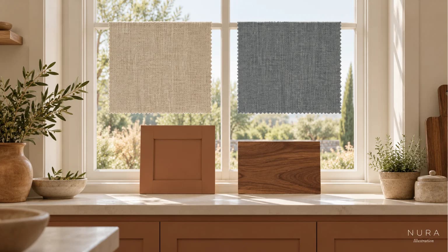
Shortlist an option related to the wall or cabinetry and another that introduces a different colour. Compare actual fabric samples upright at the intended window, alongside the cabinet, worktop and any retained dining furniture. Look during your ordinary daylight and evening lighting rather than choosing from a screen alone.
Hillarys' sample guidance describes viewing colours and prints with your home decor. A small swatch helps with that relationship; it cannot show the complete panel, pattern repeat or finished installation. Ask the blind supplier how to assess those remaining details.
Picture both everyday positions
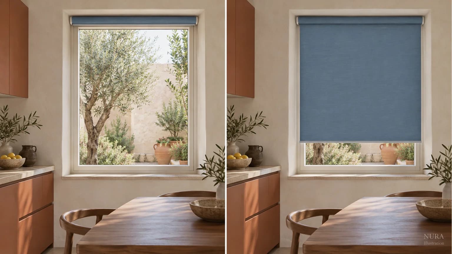
Think about when you normally lower the blind and which parts of the kitchen you see beside it. From a dining chair, the panel may sit above the cabinet run; from an adjoining room, it may belong to a wider view of furniture and walls. Record the relationship you prefer in each position.
| Blind position | Question for your palette |
|---|---|
| Raised | Does the visible fabric relate to the frame and nearby wall? |
| Lowered | Do you still want this much colour or pattern beside the cabinetry? |
For a hypothetical terracotta kitchen with a retained walnut table, oatmeal might be the household's quieter choice, while dusty blue might be their preferred contrast. Neither is automatically correct. If the blue appeals only as a small accent, ask to see a larger representative fabric view before committing. A tiny swatch cannot settle the full-panel decision.
Keep colour and product suitability together
Colour alone does not establish cleaning requirements, moisture resistance, light control or suitability for a particular kitchen position. Blinds 2go's kitchen collection separates decorative choices from practical options. Confirm the exact product, fitting location, operation and care with the chosen supplier.
Bring window and whole-room photographs, the fabric reference and cabinet finish choices to a Nura consultation. These inputs help explain how the window treatment should relate to your kitchen cabinetry and retained furniture. Our wood-tone guide starts with what you are keeping; the kitchen colour guide develops the wider palette. Explore a documented kitchen for context, and ask what relevant material examples are available before a Fulham showroom visit.